A brief look at EIN's new mobile friendly, responsive redesign - you can now easily browse EIN on a smartphone
We are pleased to let you know that EIN has had a design change and is now a 'mobile friendly' website.
When viewed on a desktop or laptop, you won't notice a great deal of difference from the previous EIN website, but when viewed on a mobile device such as a smartphone, EIN will now respond and resize to fit the smaller screen size.
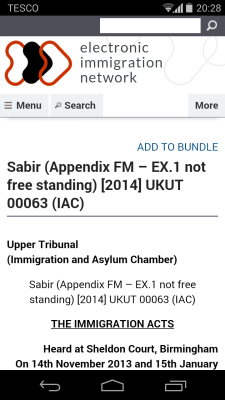
Below is an example of how a case on EIN now looks when viewed on a smartphone:
All of EIN's content, including bundles and advanced searching, is now much clearer and easier to access and view on a tablet or smartphone.
When at mobile size, the 'Menu' button will allow you to navigate to all areas of EIN, including case law, country reports, etc., that normally display on the menu along the top.
Clicking the 'More' button will display search filters and the bundle and similar/latest blocks that are normally displayed on the right-hand side of the screen. Click it again to hide.
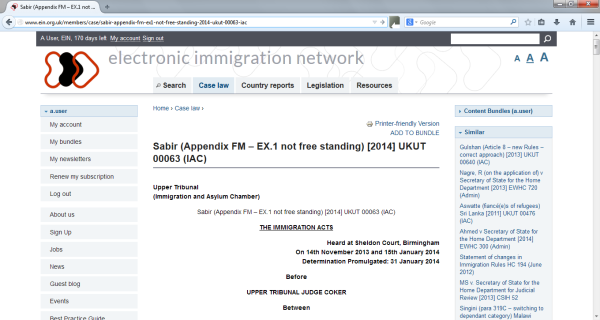
As you can see, the 'desktop' EIN has changed only slightly. The search bar has moved to the top right, we've increased the default font size on most elements and slightly changed the look of EIN, but everything functions the same as before so you won't need to relearn.
If you have any feedback or suggestions on the EIN website, let us know at support@ein.org.uk.